Bridgerton tea project
Date
April 2026
Purpose
Advanced Graphic Communications course final project
Project description
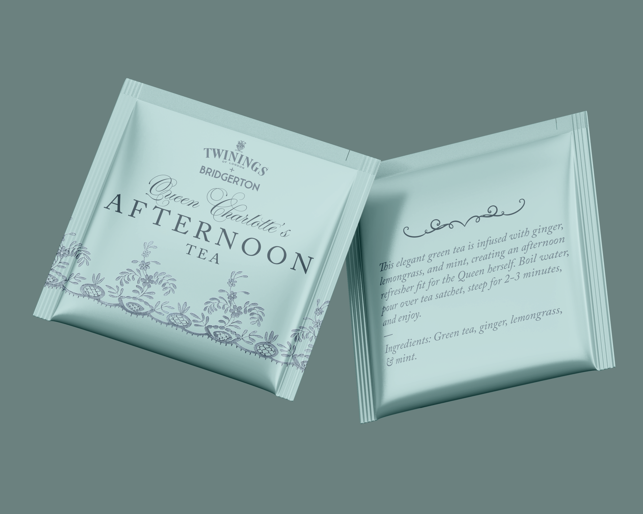
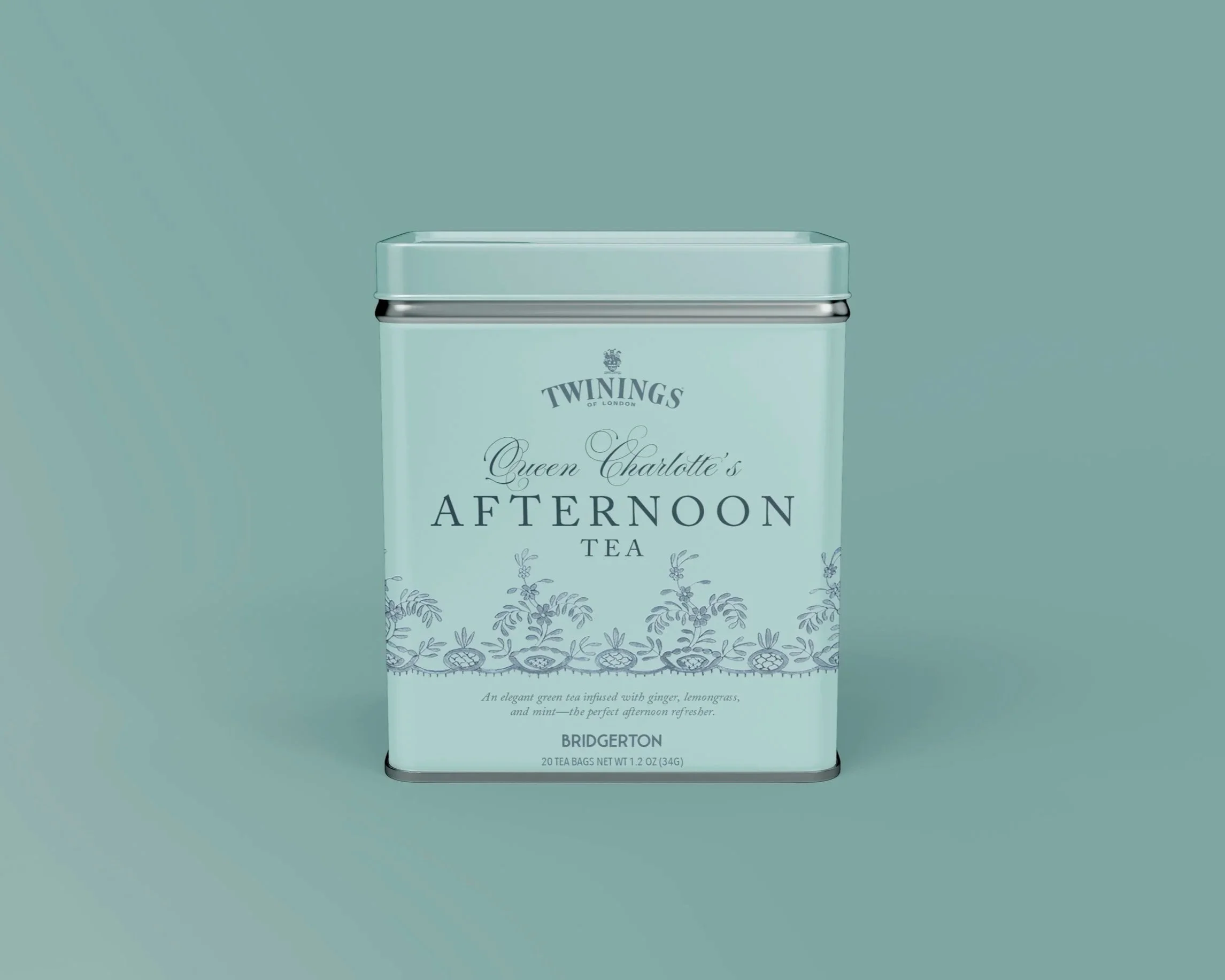
This final project was designed to give us, as graphic design students, experience in prop design for TV and movies as well as package design for store-bought products. We were tasked with designing a tea tin and sachet inspired by the Bridgerton series from Netflix that also establishes a brand crossover with Twinings tea. We were instructed to use an Adobe Illustrator die line template for the sachet and were able to use any Adobe software for the tea tin within set dimensions. We chose our own tea flavors, made our design style choices, and were given lots of creative freedom. Once we were finished with our designs, we were instructed to put them in mockups to showcase our work.
My process
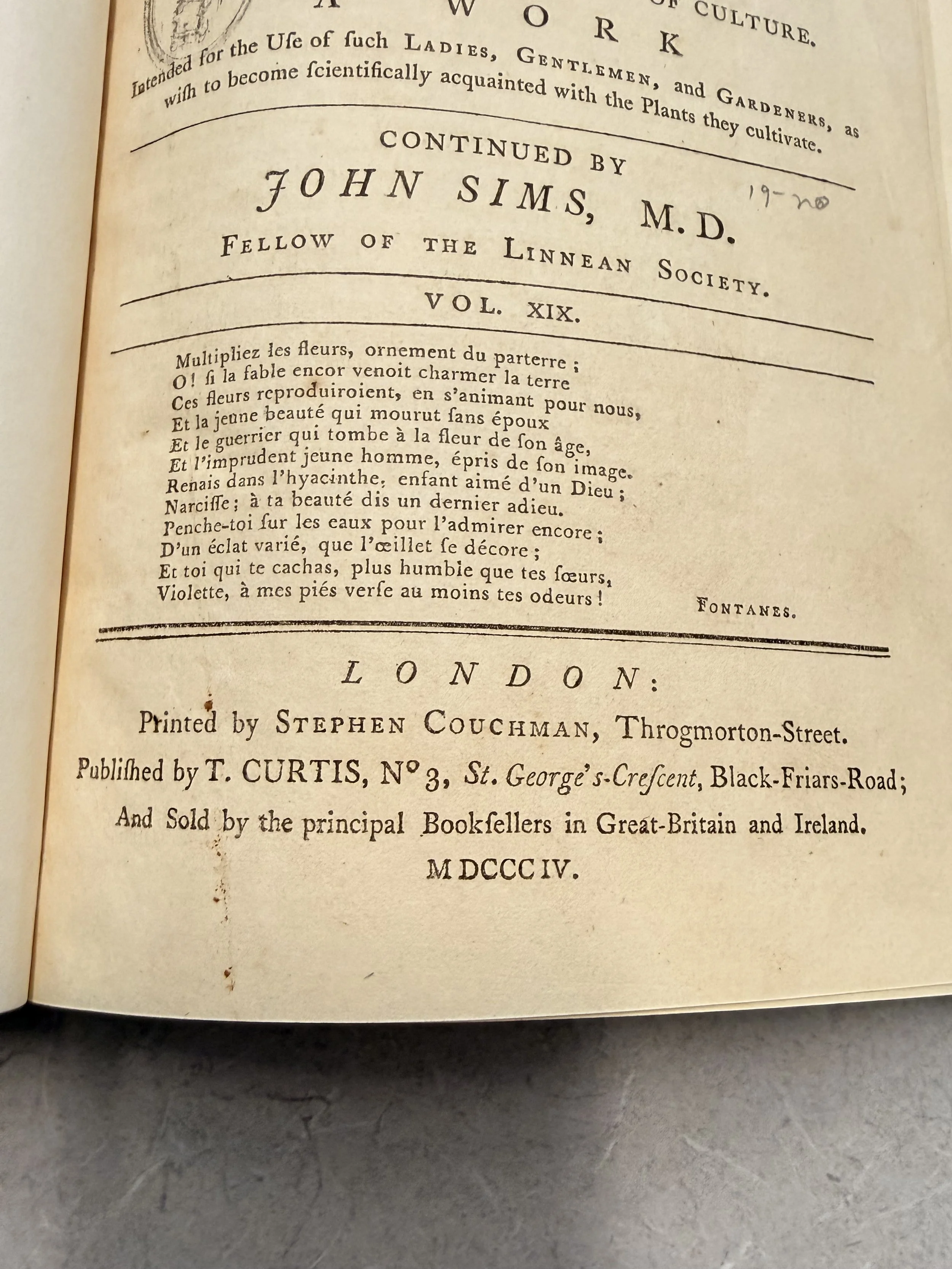
When doing preliminary research, I looked into resources both authentically from the Regency era and from the TV show itself. As a class, we spent a day looking at primary sources form regency era England and Europe as a whole. We saw everything from books to advertisements to drawings and renderings. As pictured below, two of the design choices I saw in books really stuck with me. I was a big fan of the increased tracking between letters in a capitalized serif font to create a dramatic, luxurious look. When looking at typefaces used in Bridgerton itself, I noticed that this type style was used in the show as well.
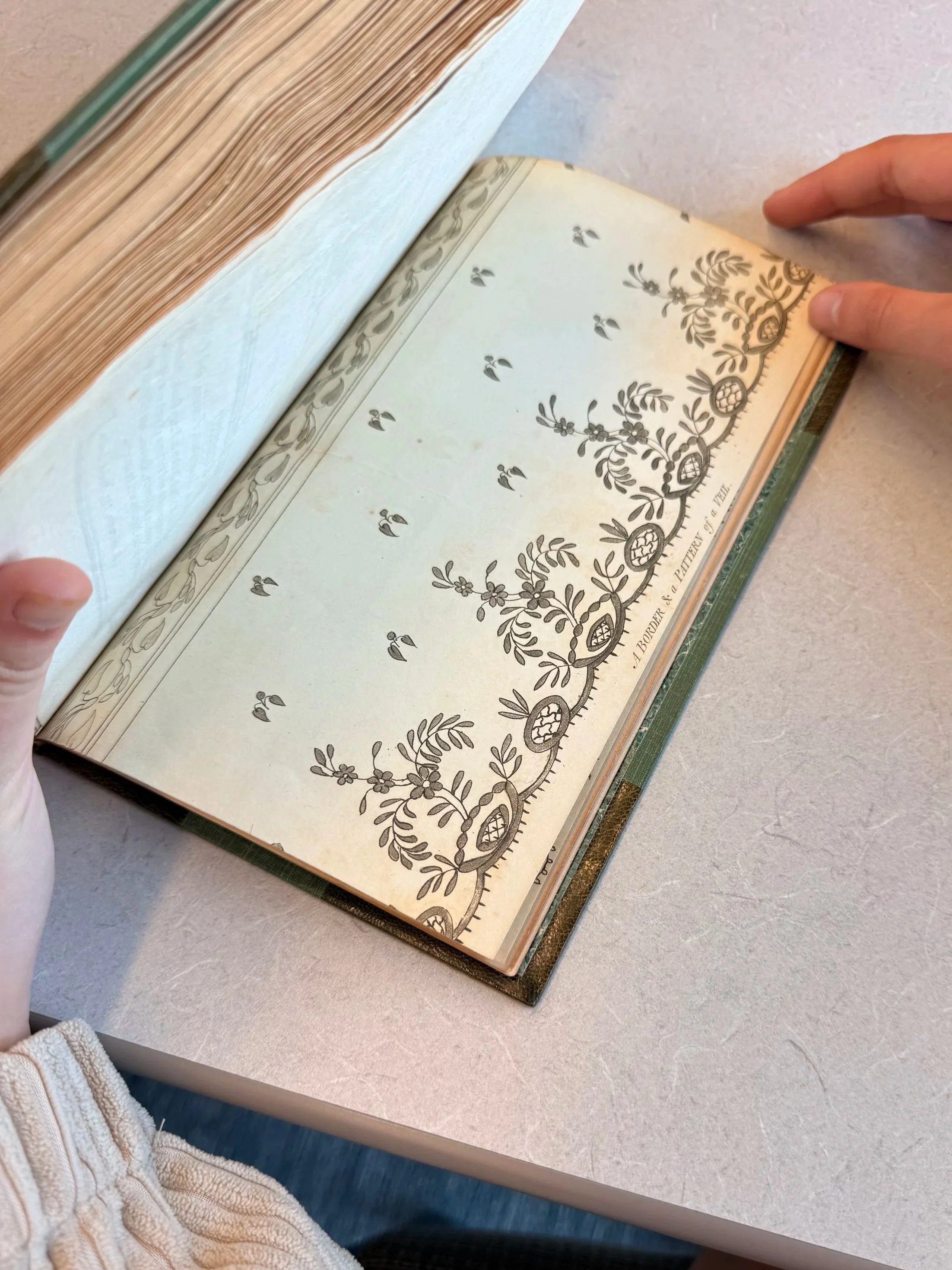
While researching, I also found that a lot of the books and advertisements used a border, often floral or made of lines, to make the designs more interesting. I really liked the idea of incoporating this concept into my design. My favorite ended up a floral pattern that I found in the back of one of the books (pictured below) and I later learned that this was a pattern used to create a wedding veil!To my luck, I found a digital copy of the wedding veil print and was able to use it in my design! I utilized a clipping mask and changed the blend mode in order to make it cohesive with the rest of the deisgn.
As for color scheme, it took some time to find one I was happy with. I knew I loved the light blue color, and I played around with some different color combinations like blue/yellow and blue/purple, but none of those were giving elegant feeling I was going for. Finally, I tried out a monochromatic color scheme and I am obsessed with how it turned out. It has elements of modern design, while still channeling the time period.
Project takeaways
I learned a lot during this project. I designed my original designs in Photoshop, and then applied them to mockups in order to showcase the work. I got experience in designing on a die-line for the sachet, which involved putting my Photoshop design into Illustrator. It was great learning all that goes into designing packaging for tea and props for movies and TV. During the project critique, my classmates and instructor informed me that the original design I had on the back of my tea sachet was a little too cartoonish for the rest of the design and that the back of my sachet did not have enough information. Thanks to this feedback, I was able to adapt my design, add more specific wording, and I am very happy with the final product. If I had to pick favorite part about this project it would be the blend of the modern color practice with the period-appropriate type choices to create a simple-but-elegant Bridgerton-themed design!