Graphic design
20th Century design style brochure
-
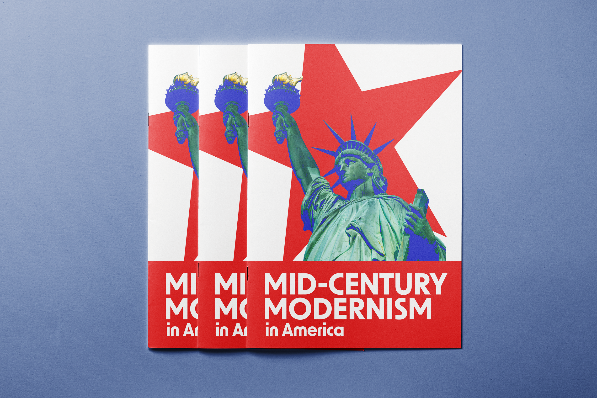
This design style brochure was meant to give us experience in designing multi-page documents in Adobe InDesign. We were given time in class to browse online and physical resources to determine a 20th-century design style that we wanted to research. We were to create an 8-page brochure with text, images, art, and anything else we would like to exemplify our chosen design style. I was inspired by the book The Moderns: Midcentury American Graphic Design by Greg D'Onofrio and Steven Heller, and chose to research the Mid-Century Modernism movement in America.
To view the full brochure, click on the image!
-
My immediate thought when beginning this design was regarding color scheme. I knew I wanted to do red, white, and blue. Through my research and examples that I was seeing in The Moderns, I was able to decide what the design traits of my brochure would be. Mid-century modern design focused on intentional white space, use of symbols and images rather than illustrations, sans serif fonts, among many more qualities.
With intentional white space being such a specific part of mid-century modern design, it felt perfect to incorporate red as the main color and blue as an accent color. With the heavy use of symbols, I decided that stars would be nice since they are often tied to American designs. For the blue accents, rather than just putting blue shapes or fonts in the design, I toyed around with the blending modes of blue clipping masks over the images to create this duo-toned effect.
Lastly, for fonts, geometric and sans serif fonts are popular in American mid-century modern designs. Futura was mentioned in the textbook I was referencing, so it felt like a perfect choice for the body copy. I went with the font New Order in capitalized form because it fit the geometric and sans serif qualities and appealed to my eye.
-
I had a great time with this project! It took a lot of time to thoroughly research, write all of the body copy, find appropriate images/examples, and design it all into a cohesive brochure. However, the challenge was extremely rewarding as it gave me invaluable experience in not only design, but learning about different design eras. My favorite part about this project was seeing all of my classmates’ brochures and learning about the different styles of design!
Purpose
Advanced Graphic Communications course project
Date
March 2026
Hawai’i Tours postcard design
-
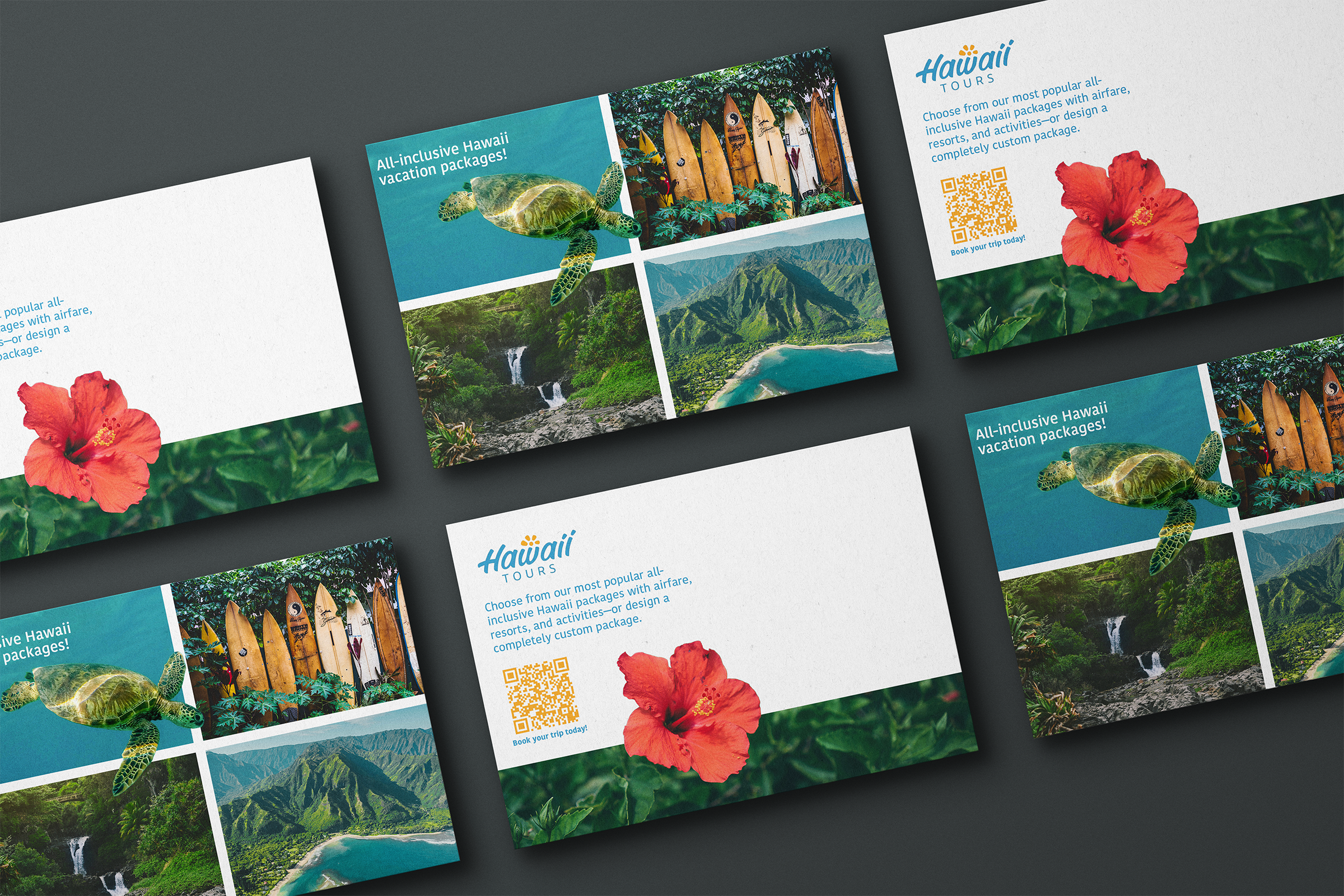
In class, we were challenged with using a combination of type, images, and colors in Adobe InDesign that both fit the existing brand guidelines of the Hawai’i Tours company and appealed to an older audience (60+). We were given the company logo as well as the body copy, but were given complete creative freedom other than that.
-
When approaching this project, I knew I wanted my design to be simple, but still visually appealing. Since I was catering to an older audience, I knew it was important to for this design to be easy to look at.
After in-depth searching, I went with these five images because I felt like they accurately depicted the various types of attractions that Hawai’i has to offer while creating a cohesive, natural-feeling color scheme.
When searching for a typeface and colors to use, I decided to go with the ones in the branding guidelines to keep things as simple as possible. When there are too many fonts and colors, things can get chaotic.
Lastly, I chose to go with the cutout effect on the turtle and flower images because it gave the postcard a cohesive feeling that was lacking in my original design.
-
Overall, I am really proud of how this project turned out. The turtle cutout was a hit amongst my instructor and peers, which made me excited. With this project involving a good amount of time on the front end, it definitely helped me solidify a good process for the brainstorming and ideation phases of my design process.
Purpose
Foundations of Graphic Communications final
Date
November 2025
Italian Consumerism poster
-
For our final grade in this Italian Culture class, we were assigned a creative project that could be executed in any medium we would like regarding our favorite topic from the class. We were encouraged to be creative and have fun with it!
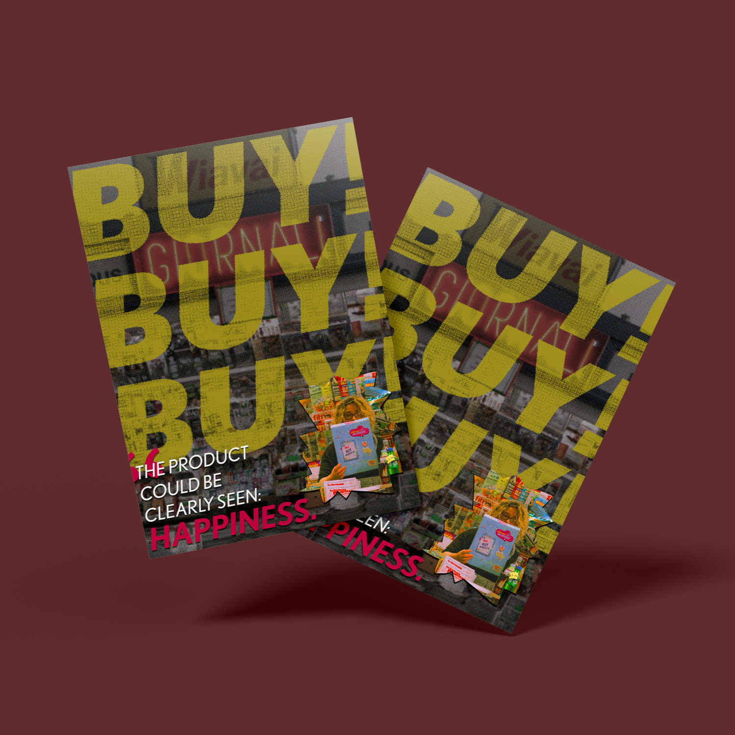
My chosen topic was Consumerism in Italy post-World War II. After the war, Italy received $1.5 billion to help them rebuild their economy and keep them from converting to Communism. Supermarkets were then introduced in Italy and for the first time, Italians could get everything they need in one place—rather than having to go to a bakery for bread, a butcher for meat, a market for vegetables, etc. From this, consumerism was born and Italians were obsessed with shopping.
-
The main goal of this poster was to highlight the intensity of how badly Italians wanted to make purchases during this era. I was inspired by the story Marcovaldo at the supermarket by Italo Calvino, where the author utilized the repetition of the word “Consume!” in between phrases on the first page. “Consume!” was slightly too long of a word to use, so I shortened it to “Buy!”
I chose to use bold fonts and bright colors to add intensity to the poster. The quote in the bottom left came from an article that we read in class that highlighted the Italian excitement around consumerism and shopping.
To further drive home the focus on consumerism, I made the choice to keep everything from the image black and white besides the cut-out of the shopper and the light-up sign.
-
I really enjoyed this project. As soon as my professor told us that we would be able to use any medium of our choosing, I knew I wanted to use Adobe Photoshop. I was pretty familiar with the software at this point, but I wanted to use this project as a way to continue learning and getting experience. I learned a lot and am very happy with the final product!
Purpose
Italian Culture course final project
Date
December 2025
Case studies
-
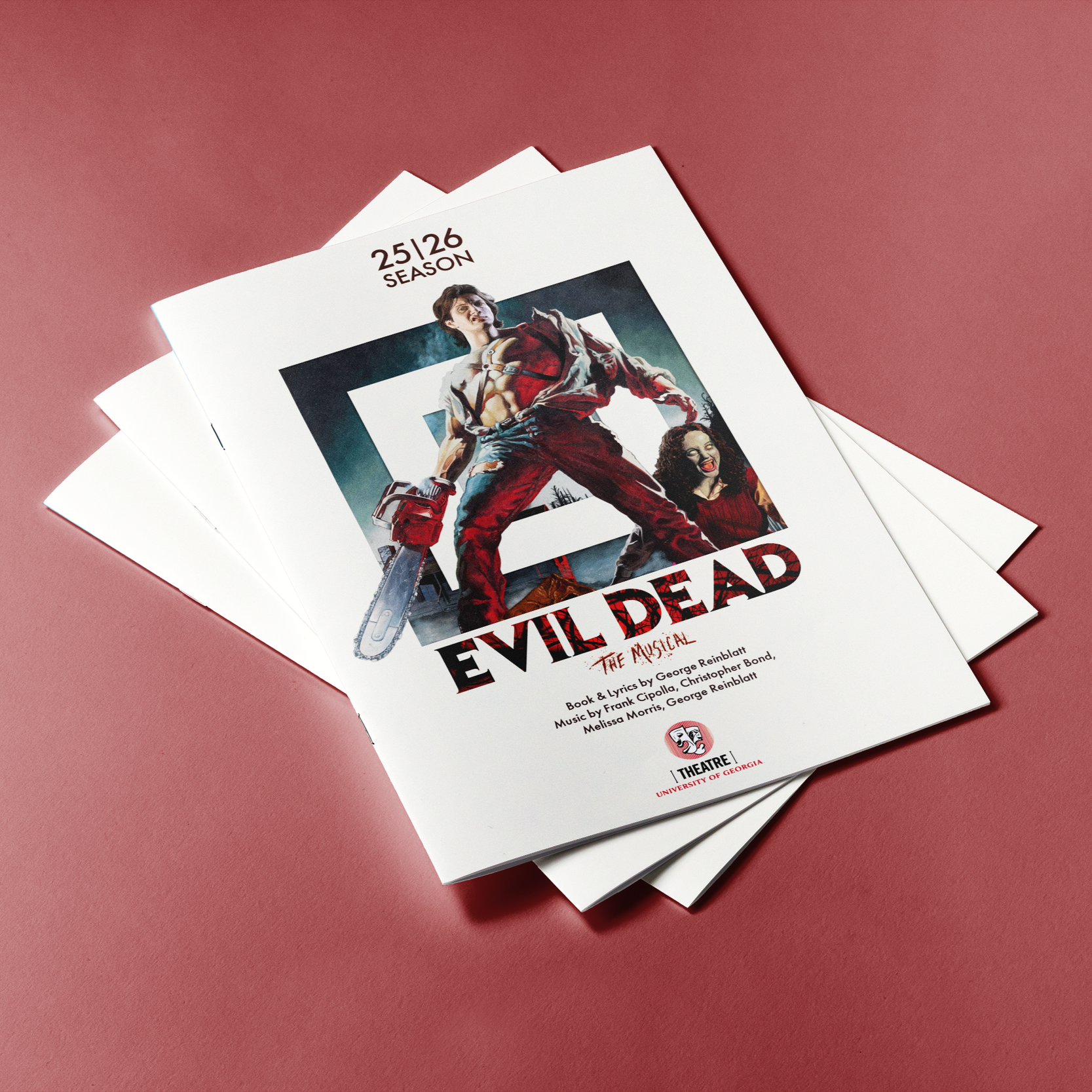
![Promotional program booklet for the musical "Evil Dead" at the University of Georgia Theatre, featuring a character holding a chainsaw and a woman with a bloody face on the cover, against a pink background.]()
UGA Theatre programs
-
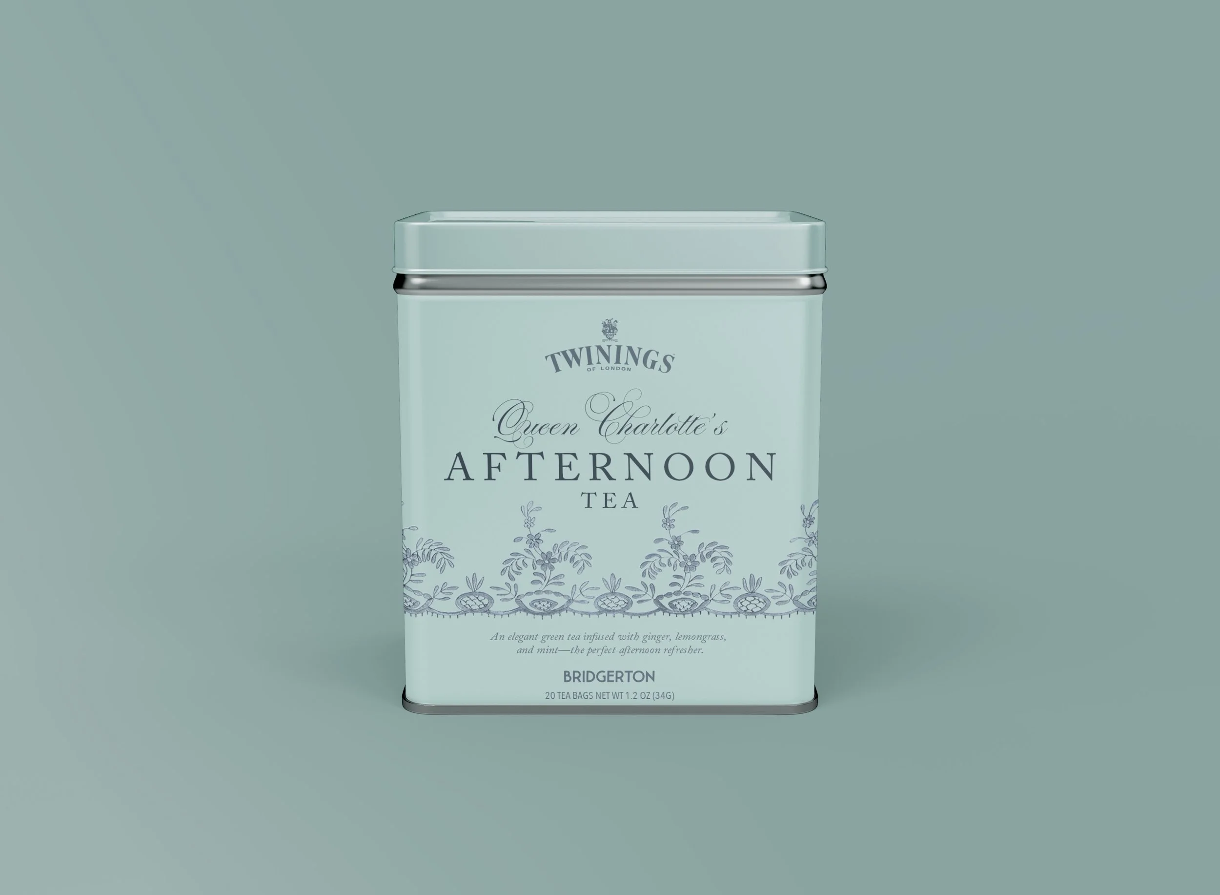
![A rectangular, light teal tin container with a silver rim and lid, featuring branding for Twinings Queen Charlotte's Afternoon Tea, with a decorative floral pattern and product description at the bottom.]()
Bridgerton tea project